![]() As many of you will have seen the team is refreshing the look and feel of Consortium at the end of January.
As many of you will have seen the team is refreshing the look and feel of Consortium at the end of January.
We are all super excited to share this with everyone and also wanted to share some of the thinking and rationale behind these decisions, answering some of the questions you might have.
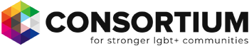
What we should be called was the topic of many exciting yet challenging conversations throughout the rebrand process. We want to better recognise the diversity of our communities and felt that having LGBT so prominent did a disservice to parts of our communities. There were various elements discussed that got us to our new logo and you will find some explanation of how we got there below.
Language
It is ever-evolving and our concern was whatever we chose to use could quickly become less relevant. We noted that on a day to day basis we hear people talk about “Consortium” and we ourselves tended to use this over “LGBT Consortium” so with this is mind it felt it was the right decision to shorten the name, with consideration of the elements below.
Strapline
As you will see, we have included a reference to LGBT+ in our strapline. This was a conscious decision to include community-specific language in the strapline as it is an element of the branding that was easier to change over time—more so than the main logo would be. We chose LGBT+ as the consensus was this was the most inclusive way for us to proactively portray inclusivity, whilst not falling into the trap of “alphabet soup”, which can so easily make our community-issues more complex for both our communities and our allies.
We have also focussed on collaboration in the strapline so we can continue to promote our core themes of collaboration, sustainable and resilience. We firmly believe that our LGBT+ communities are stronger when they work in collaboration and Consortium wants to support this through our unique position in the sector.
Rainbow element logo
By losing “LGBT” in our main name, the entire team wanted to ensure we still retained a strong visual link to our communities. Whilst it can sometimes feel the rainbow is over-used and doesn’t always represent all parts of our communities, it is still a strong visual connector. We therefore took the concept of the rainbow and formed it around our “C” in small triangles but not in the traditional red to purple sequence with the hope it would be resonate with more people. The triangles represent how we are all inter-related and connected. We also consciously used grey triangles for the gap in the “C” to provide further representation of those parts of our communities who might not connect to the rainbow colours.
Retention
Since formed originally in 1998, Consortium has developed as a strong part of our LGBT+ communities. Our name is relatively well known and we wanted to remember the past whilst projecting forward for a strong and resilience future both for us and the wider sector. Therefore, after much consideration we chose to retain the name Consortium rather than take a completely new look so we can use the presence our name already has and use the refreshed branding as a springboard to open new doors and talk to new audiences.
Funding
Rest assured that we consider our core funding for work with Members as the absolute priority. Consortium has for sometime wanted to explore a refresh of its branding and have been lucky enough to get the support of a funder to allow us to do this. This funding was specifically to look at internal development, including this element of rebranding, so no money destined for our Engagement work has been used.
Our hope is our Members and other stakeholders agree our new branding is fresh, professional and focusses on what really matters for the sector’s umbrella body—there is power in unity and by supporting collaboration we will be stronger and more sustainable.